14 Jan 2013
by emilyv18
in Typography for Print
Tags: analysis, analysis of project work, book design, brief, design, ideas, images, typeface design, typography, Year 2
Overview
I found this project interesting as it allowed me to gain knowledge about Adobe InDesign, especially with the small assignments which allowed me to gain practical experience working with stylesheets, alignment, spacing etc. I also learnt a lot about how to deal with typography, in which we learnt about the construction of a typeface, how type works with each, identifying typefaces and eras, and how to deal with type. More
11 Jan 2013
by emilyv18
in Typography for Print
Tags: book design, design, ideas, images, typeface design, typography, Year 2
Mock Up Process
In each of my designs I printed a copy, whether it was to look at structure, content or colour. I found this a useful process as it allowed me to look at different factors that may not be so evident when looking at a screen. I found this particularly useful when looking at sizing, in terms of font weights and how certain elements fitted onto the page. Also I was able to make notes and annotations on my mock ups to show me what I needed to improve or change. It also helped me think about how the book would work as a physical item.
These are the mock ups I produced throughout the project:
Book 1
Book 2
Book 3/4
Book 5/6
Printing
I decided that I wanted to have a cream background to the pages, and as the printer only had bright white paper, I bought some paper which had the texture and colour which I thought was suitable. I tested it:


However when I tested the paper at the printers, they told me that some of the paper was too thin (which meant that the ink bleed), while the other paper was not suitable with the printer. This is what was produced:


Therefore I decided that the best option was to print on there paper (which I knew would be suitable) and change the background of each spread to a cream colour. I found this the easiest and simplest solution, particularly with the time constraints. If I was taking the project further I would probably test more paper to see what would work.
09 Jan 2013
by emilyv18
in Typography for Print
Tags: book design, design, ideas, images, typeface design, typography, Year 2
These are the final concepts and ideas for the type specimen book:
Book 5
After printing my fourth version, I wasn’t happy with how all the pages flowed, I therefore decided to move the penguin spreads to the back, to make the chapter pages slightly more central. I also realised that the colour, for the background, on my previous versions wasn’t quite right, as it was more purple than blue. On the second spread I decided to right align the text on page 4 as the fully justified version was a bit too spaced out. I also took out the page numbering because it wasn’t fitting in with the design.
Book 6
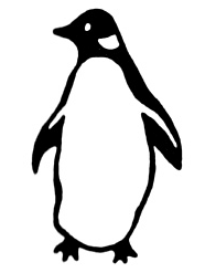
I realised that I have an odd number of spreads, and when I printed I found that I couldn’t bind it properly. I therefore decide to add another spread, in which I wanted to produce extra pages about penguin. In my previous research I found out that the original penguin covers have extended beyond just books. In recent years they’ve been used in designs of, deckchairs, mugs, and bags. However I didn’t want to use any photos within my book, so I decided to explore other ways of displaying these items. I started making illustrative icons out of the typeface, to represent these three items, in which I thought they fitted in well with the design of the book. I also incorporated the penguin logo, as I thought it was quite an important element of the brand. I have also added a slight cream background to show how I want the book to look as a finished piece.
16 Dec 2012
by emilyv18
in Typography for Print
Tags: design, ideas, images, typeface design, typography, Year 2
One of the requirements for the book was to re-design the typeface to reflect on my concept. I decided to base my designs on the original penguin logo, in which I created blocks of white as a relief in the black letters, in order to emulate the effect on the logo.
I had already produced some initial work on the lower case ‘g’, which I wanted to use on the covers, as a logo for Gill Sans:


I thought it would be apt to reproduce the title; ‘Penguin Books’ as I think it will fit in well on the pages dedicated to Penguin itself. I think it came out well, particularly as I think it has a strong concept behind, which gave me clear direction of what I wanted to do with it.
07 Dec 2012
by emilyv18
in Typography for Print
Tags: design, ideas, images, typeface design, typography, Year 2
In beginning this project I have produced some rough first drafts of the type specimen book. I have focused primarily on the covers in these designs, in which I have measured out elements and spacing according to those displayed on the original Penguin books, as well as margins within the books.
More
Previous Older Entries


