Final Brochure

The principle idea were for the characters to act as a guide, to convey a journey around the house. Our initial intent was to create a map or floor plan to reflect on this idea, in which we considered the interior of each room and how there would be a page on each part of the house, with a corresponding character for which to tell the tale. Subsequently the lines in the brochure aim to deliver the idea that the content relating to the artefacts are framed. Furthermore we also have fold out sections, which reflect on the functionalism of a map, whilst also interacting with the house. The colour palette that we chose reflect on the colours which exist in the museum. The outcome of which presents a very clear and concise picture for the ultimate consumer. Also the brochure can be easily used and allows different demographics to navigate around the house effectively.


Final Brochure Layout

After meeting up as a group again we realised that the long fold out design was not particularly user friendly. We therefore looked over it again to try and think of alternative ways it could work. We decided to go back to experimenting with two fold out, however this time we decided to have all the rooms on the inside of the fold outs so that when they both opened out completely the pages (rooms) would be presented in a line, flowing from one to the other. Therefore, on the other side of the fold outs, we decided to have the introduction placed on the back of the font cover and the list of events on the back cover, in which they would sit next to each other when opening the brochure.

Analysis

Overall this is a far more effective design, as it is far easier to use while also having the pages flow far more easily through the brochure.

1st spread ( inside the front cover):

final brochure

2nd spread (back of the first spread):

final brochure2

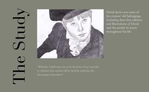
3rd spread (inside the back cover):

final brochure3

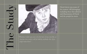
4th spread (back of the third spread):

final brochure4

Logos/Masthead

Initial Logo:

HR logo

This is the logo I made for my advertising poster. I used the idea of train signs, with the use of the silhouetted train.


Train Signs:

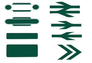
train signs

I based these designs on the old British Railway signage. I thought about how these could be used for a masthead, as well as the arrows being used for navigation in the magazine.


Developed Masthead:

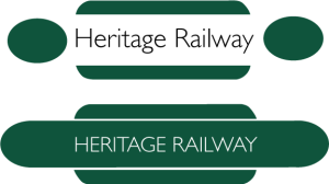
heritage logo 1

I thought about how text could be included on the signs. I decided to use Gill Sans, as it was the typeface originally adopted for British Rail.


Final Masthead:

final logo

This is the final design for the masthead. I decided to change the colour, as I thought the green wasn’t as aesthetically pleasing, in which it didn’t fit in well the black and white photos. I thought the blue had a softer tone.

Cover Idea

Cover Idea:

dickens covers dickens covers2

Developed Ideas – Layout

I experimented further with the layout design, in which I decided to have fewer lines on the pages to give a clearer structure and definition, as I didn’t want the design to be overcrowded. Also Rahul, experimented further with the colour palette of the brochure and we decided to use the dark red and white, which are colours that can be found within the museum.

Fold Out 1:

In the first design, I kept with the idea of having a double sided fold out; considering the order and flow of the pages, how the rooms work independently, as well as the fold out as a whole.

Final Design 2 Final Design 22

Alternative Fold Out:

Instead of having one long fold out we also considered having two separate (double sided) fold outs, which would open up from the back of the front cover and back cover. However we felt that the idea of a journey would not be conveyed as effectively in this design, as the pages would not flow as seamlessly.

Fold out 1 (back of Front Cover):

Final brochure Final brochure2

Fold out 2 (back of Back Cover):

Final brochure3 Final brochure4

Initial Ideas – Layout

These are initial layout ideas which I produced:

The designs are based on the structure of the last mock up idea from the previous post. I experimented with the arrangement of the pages (rooms) and how they may flow from one to the other. Also I looked at the idea of implementing lines within the design, as I was interested in exploring our original floor plan concept, in which the lines aim to deliver the idea that the content relating to the artefacts, in the house, are framed. They express how the interior of the rooms may be organised.

Initial design Developed Design

Screen Shot 2013-04-28 at 18.54.51

Developed Mock ups (part 2)

I developed  idea 1 from the previous post:

This is a clearer mock up of how the brochure could work; considering dimensions and where information may be placed. I decided to go for a landscape design as we felt that it could represent the room structure far more effectively.

Developed single fold out idea:


Developed Mock ups

Thinking about the map/ guide idea, I started experimenting with the idea of fold outs:

Idea 1:

Idea 2:

Idea 3:

Analysis 

I thought that these mock ups reflect on the travel map idea, to convey a journey around the house. However, we felt that idea 2 and 3 would be complicated to make, as we wanted the museum to be able to make copies of the brochure with relative ease. Therefore I decided to develop idea 1 further, as the fold out would be easy to use, as well as relating to the journey aspect of the brochure.

Initial Mock ups

After thinking about our concept we decided to produce some mockups:

Some rough ideas thinking about floor plans and maps, in how they can be used to reflect on the house:

My Idea:

A fold out, whereby each page is the layout or structure of the individual rooms in the museum – exploring floor plan idea. However this would be very difficult to make/ print and we want the means for the Museum to print many copies of the brochure. More

Content

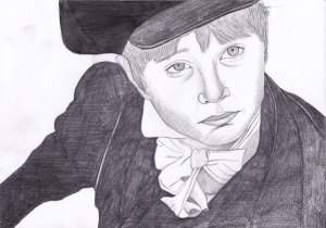
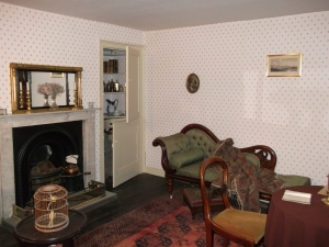
I produced the content for the brochure; it includes the character descriptions and their relationship with each room, as you move around the museum. For example:

Room: The Parlour 

Character: Betsey Trotwood 

Miss Betsey introduces you to her parlour; the old-fashioned furniture is brightly rubbed and polished and her own inviolable chair and table sit by the round green fan in the bow-window. The cupboard in the corner is where Miss Betsey produces her concoctions to pour down the throat of her young nephew, David.  A formidable personage, Miss Betsey is the great-aunt of David Copperfield and the principal magnate of his family.

“My mother had a sure foreboding at the second glance, that it was Miss Betsey. The setting sun was glowing on the strange lady, over the garden-fence, and she came walking up to the door with a fell rigidity of figure and composure of countenance that could have belonged to nobody else.
When she reached the house, she gave another proof of her identity. My father had often hinted that she seldom conducted herself like any ordinary Christian”

We also decided to use these photos and illustrations for the brochure. We decided to only have one or the other  (character illustration or photo of the room) on each page, as we didn’t want to overcrowd the design. These are the images we’ve decided to use:

The Study (Main Room) – David Copperfield:

David Copperfield


The Parlour – Betsey Trotwood:

DSCF0791

More

Previous Older Entries Next Newer Entries